On a sunlit Saturday in Kingstown, the St. Vincent and the Grenadines Tourism Authority (SVGTA) hosted an official media launch for its highly anticipated new national tourism brand, operating under the evocative tagline “Set Your Spirit Free”. The event was deliberately scheduled to address widespread public debate that erupted just three days prior, when the new logo and associated visual assets were first unveiled to crowds gathered at the nation’s independence rally. In the days between the initial reveal and the Saturday briefing, social media platforms and local community forums were flooded with mixed public reactions, with the most vocal criticism centering on the logo’s choice to render the country’s full name entirely in lowercase lettering, as well as questions over whether the design’s natural imagery was distinct enough to set the destination apart from other Caribbean island nations.
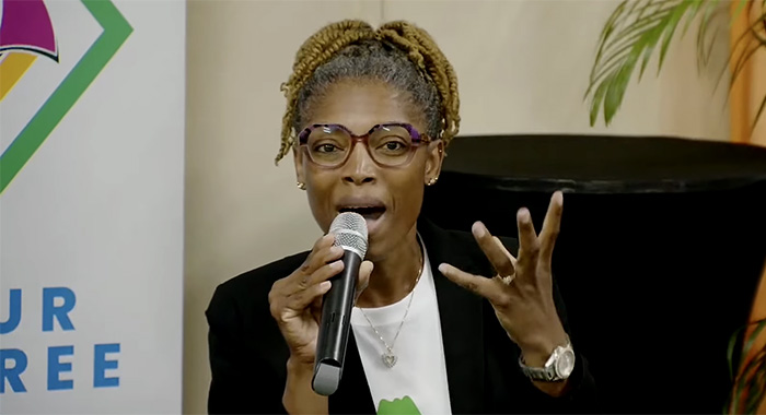
At the launch, SVGTA leadership walked attendees through every layered component of the new visual identity, confirming that while minor technical tweaks had been made to the presentation formatting of the assets, the widely discussed lowercase lettering would remain fully intact. When pressed by local reporters to explain the creative rationale behind rejecting formal capitalization for the country’s name, Brand Manager Natasha Anderson posed a pointed rhetorical question to the assembled audience: “When you think of us… do you think we’re formal people? Do you think we’re stiff?” Answering her own question in the negative, Anderson emphasized that the typography was a deliberate creative choice designed to mirror the well-documented laid-back, approachable character of the Vincentian people. “A word carries its own personality and feeling, shaped entirely by the font and styling you choose,” she explained. “This lowercase look is not an oversight—it is a deliberate reflection of who we are: warm, unpretentious, and not putting on a performative formal front for any visitor or global audience.”
The briefing also addressed widespread public concerns that the logo’s prominent depictions of mountains and coastal waters were generic visual tropes that could easily be applied to any number of competing Caribbean tourism destinations. SVGTA CEO Shafia London pushed back on that critique, noting that St. Vincent itself ranks as the second most mountainous island in the Windward chain, with a dramatic, rugged volcanic topography that often surprises first-time visitors who assume the island is far larger than its official landmass would suggest. “Many Caribbean islands have mountains, but none have the dramatic, sweeping volcanic peaks we do here, crowned by the iconic La Soufriere volcano that defines our national identity,” London stated. She went on to break down the layered, often easily overlooked symbolism woven into the design: the water elements pay homage to the nation’s globally renowned sailing waters, which control nearly 40% of the entire Eastern Caribbean sailing market share, while the mountain silhouettes double as a tribute to the country’s hundreds of cascading waterfalls—an asset the SVGTA is currently working to verify totals more than 365 individual falls across the archipelago. A close zoom into the central negative space of the logo reveals a subtle outline of the full Grenadines island chain, while the diamond-shaped accents scattered across the design can be interpreted by viewers as everything from traditional stilt homes perched on mountain slopes, to a quiet nod to the national flag, to customizable picture frames that invite visitors to imagine their own ideal vacation experiences under the “Set Your Spirit Free” banner. London added that her personal favorite hidden detail is the small candle motif woven into the design, which she said represents the persistent, unextinguishable warmth and vibrant spirit of the Vincentian people that remains lit at all times.
Public Relations Officer Alex Barnwell expanded on the discussion of national uniqueness by pointing to the archipelago’s unparalleled level of inter-island accessibility, a feature almost unheard of across the wider Caribbean. The nation boasts multiple international airports and seaports, with a major upgraded port facility currently under development on Union Island, making day trips between even the most remote Grenadine cays a simple, seamless task. “You can wake up in Kingstown at sunrise, catch a 20-minute flight to Union Island, and be back home the same evening—something you could never pull off in places like the Florida Keys, where inter-island travel is a logistical nightmare of long drives and wait times,” Barnwell explained. He concluded by noting that the true distinctiveness of the brand identity lies not in any single isolated visual element, but in the full, combined tapestry of dramatic landscapes, world-class waters, unmatched accessibility, and the tight-knit community of farmers, fishers, and local cultural organizers that make every island in the chain feel entirely one-of-a-kind.
Tourism Authority addresses lowercase lettering, symbolism in new logo